
The Cover That Ate Itself
This shouldn't have taken a month to write, but it did…
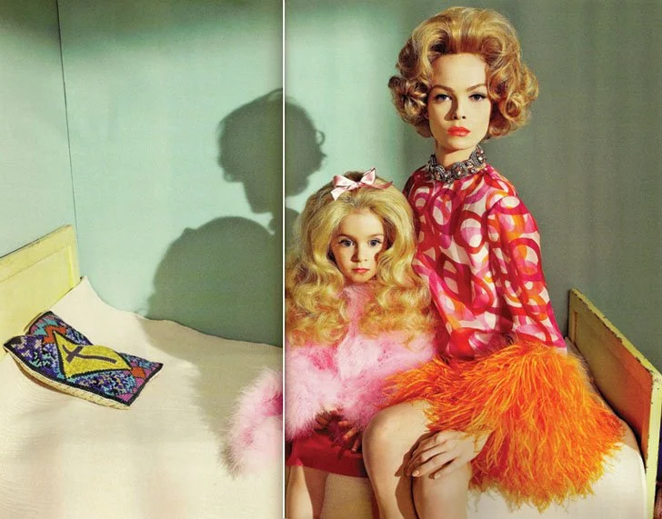
Take a look at this image.
Go on, really look at it. A heavily made-up young girl, wide-eyed and doll-blank, draped in pink feathers, sitting on what appears to be her mother's lap. It reminds me of that bizarre documentary, Living Dolls: The Making of a Child Beauty Queen (HBO, 2001).
Now: what book is this destined to be wrapped around?
If your answer was Lolita, you'd be in good company. Or Valley of the Dolls, maybe. Something by Patricia Highsmith? A particularly dark episode of Black Mirror? When Penguin posted this image on Facebook in August 2014 and asked followers to guess which classic it would be gracing, those were exactly the answers that came back. Nobody guessed correctly, even with the hint that the answer was "worth more than a golden ticket."
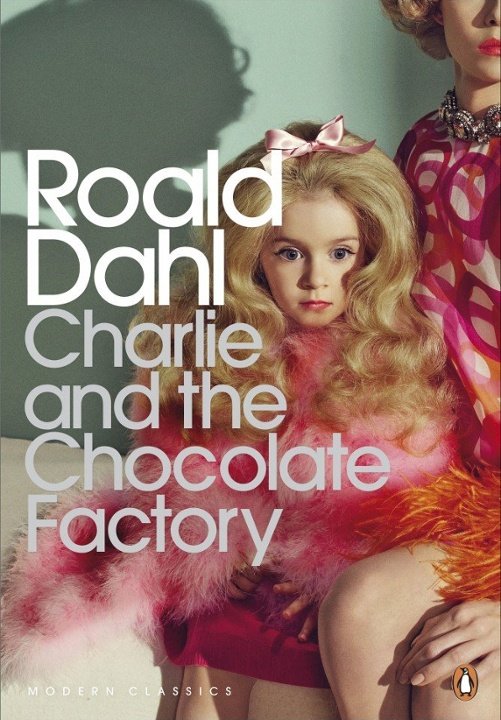
If I’d been in the room, I would have been sticking my hand in the air and claiming that somebody had made a terrible mistake, but it found itself wrapped itself around Roald Dahl's Charlie and the Chocolate Factory anyway (published by Penguin Modern Classics to mark the book's 50th anniversary) and became one of the most derided book covers in living memory.
So far as my research will take me, this is the story of how it happened, why it was always going to go wrong, and what the whole sorry episode reveals about the relationship between a book, its cover, and the readers who feel they own both.
First, the Book Deserves Better Than This
Before we get to the disaster, let's talk about what a genuinely good Charlie and the Chocolate Factory cover looks like — because the book has had several, and they tell their own interesting story.
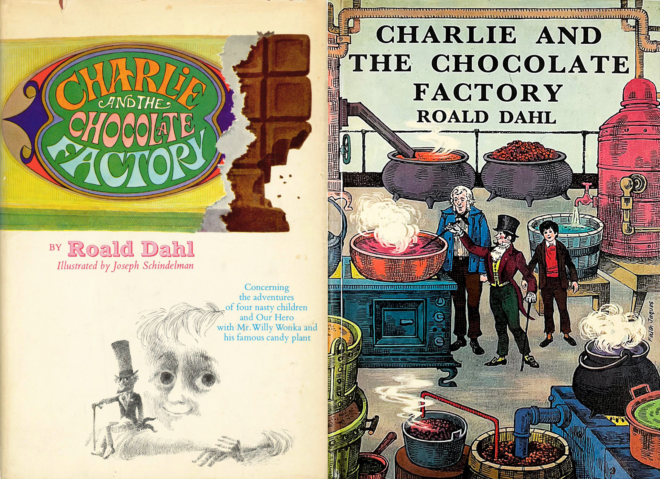
The first US edition, published by Knopf in 1964, was illustrated by Joseph Schindelman. Dahl's first choice had actually been Maurice Sendak (good choice, Mr Dahl!) who was then in the process of writing Where the Wild Things Are, whose sensibility, with its roots in northern European folklore and its unsentimental view of childhood, would have been a natural fit. Sendak wanted too large a cut of the profits, however, and was in any case otherwise occupied making one of the great picture books of the twentieth century. So Schindelman got the job.
It was a happy accident. Schindelman approached the book with what he described as a "Dickensian" feeling — all pen and ink, Victorian in spirit, slightly sinister in execution. His Willy Wonka is genuinely unsettling in the best possible way: not a bumbling eccentric but something more… feral? The illustrations understood that Charlie and the Chocolate Factory is not, at heart, a cosy book. It is a book about appetite and punishment, about the thin line between delight and dread. Schindelman drew that line.
The first UK edition, published by George Allen & Unwin in 1967, was illustrated by Faith Jaques and gave us a warmer, more domestic cover much closer in spirit to the classic British children's book tradition.
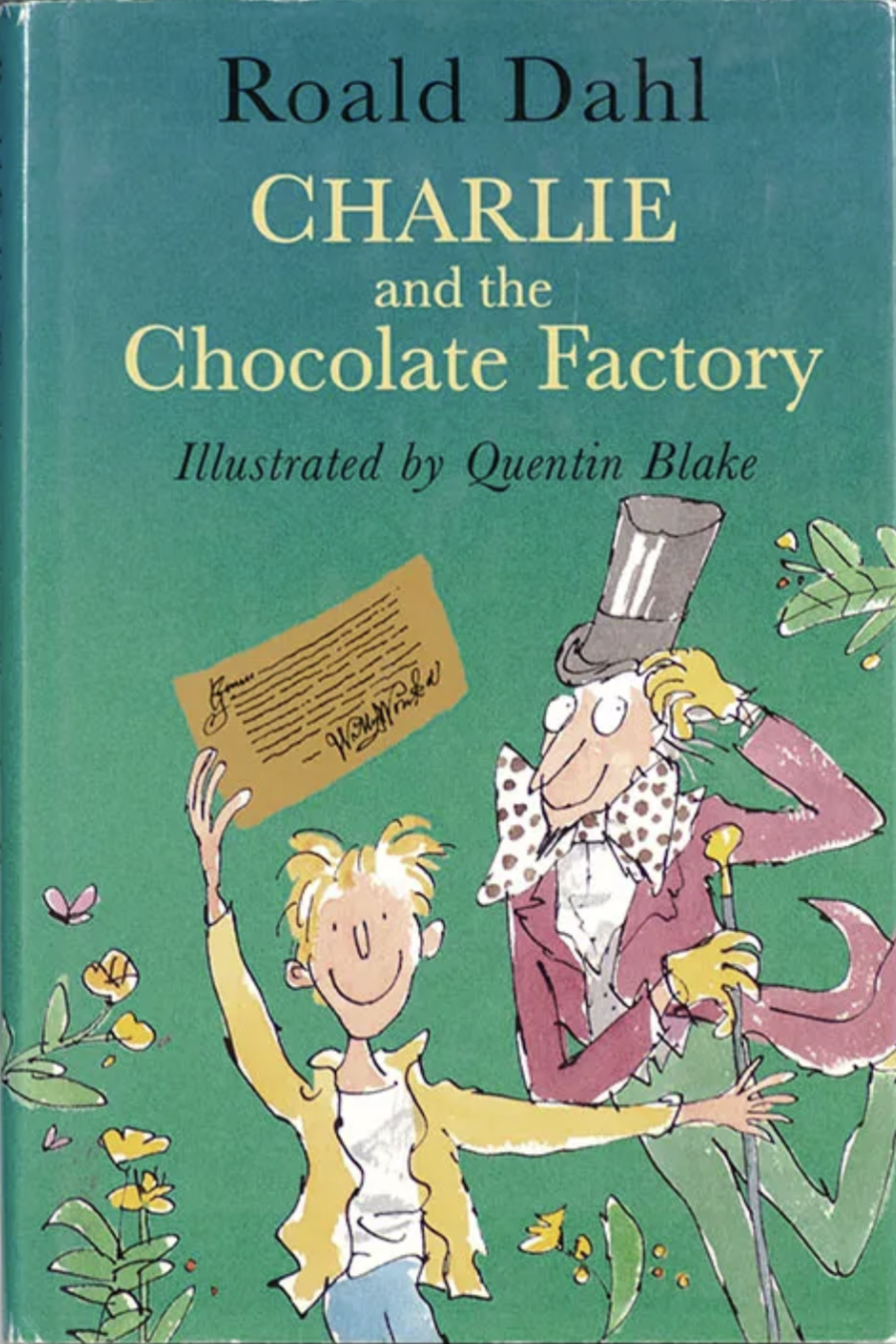
Then, in 1995, came Quentin Blake — already Dahl's most celebrated visual collaborator — whose scratchy, anarchic line drawings became the definitive visual language for the book in most readers' minds. Blake's illustrations have a quality that's easy to underestimate: they look chaotic and spontaneous, but they’re so much more than that. His Wonka is thin and angular and slightly manic. His factory has genuine menace beneath the whimsy. His children are caricatures, yes — but caricatures in the tradition of Daumier, where exaggeration is a tool of moral judgement.
The point is: by the time Penguin got to the 50th anniversary edition, there was an extraordinarily rich visual tradition around this book. Not a straightforward one, but a tradition that had always understood that Charlie operates simultaneously on multiple registers. It is funny and dark and morally clear and visually inventive. Any cover worth the name should be at least some of those things.
The Penguin Modern Classics cover is none of them.
The Cover Nobody Commissioned
Bizarrely, Penguin didn't commission a photographer to create something new for Charlie and the Chocolate Factory at all. They licensed an existing image.
The photograph was taken by Argentinian photography duo Sofia Sanchez and Mauro Mongiello, a pair of genuinely talented artists who met in Buenos Aires, moved to Paris, won the prestigious Picto Prize for young photographers in 2002, and went on to shoot for Numéro, Vogue, The New York Times, The New Yorker, and a string of major fashion houses including Armani and Lanvin. Their work is characterised by what one profile described as "just the right amount of colour, a splash of surrealism, intelligent references and a perfect sense of dress."
This specific image that Penguin used was cropped from a shoot that originally appeared in Numéro magazine in 2008 - that’s the image at the top of the post. The shoot was themed around Mommie Dearest, which means Joan Crawford, toxic motherhood and the grotesque performance of feminine perfection. The doll-like child in pink feathers, the cropped-out mother figure in garish fabric: in the context of a high-fashion editorial about performative parenting and maternal narcissism, is bang on the nose. It's a knowing, sophisticated image making a pointed cultural reference.
Lifted out of that context, it becomes something else entirely. Let’s look at it again:
This is one of the fundamental problems with the cover, and it's one that got surprisingly little attention in the subsequent furore: nobody designed this cover for the book. A designer, presumably someone at Penguin (who has never been named so far as I can tell), went looking in a picture library, found a photograph they thought was suggestive of Dahl's "darker themes," and licensed it. The gap between what the image was made to do and what it was being asked to do is enormous - you simply can’t build a bridge that big in the human mind and readers, even those who couldn't articulate exactly why the cover was wrong, felt it in their soul.
The Facebook Reveal: A Masterclass in Accidental Honesty
Penguin unveiled the cover on their Facebook page with a teaser. They posted the image alone, without the title, and invited followers to guess which classic it would accompany. "We could give you a clue," they wrote, "but that would be worth more than a golden ticket."
It was, in retrospect, one of the more self-defeating pieces of marketing in recent publishing history.
The golden ticket reference was unambiguous. And yet, even with that clue, almost nobody guessed Charlie and the Chocolate Factory. As I said, the overwhelming responses were Lolita and Valley of the Dolls. When Penguin revealed the answer, the backlash was instant… which can’t have surprised anybody, surely?
Think about what this means from a pure design standpoint. A cover's first job is to communicate something — not everything, not literally, but something — about the book it contains. If the cover produces completely the wrong associations in almost every person who sees it, it has failed at the most basic level of its function. Penguin's own teaser campaign proved the cover didn't work before the book even went on sale. They just didn't notice, didn't care or maybe the Art Editor was on holiday.
The comments on the Facebook post numbered 677, and they were not kind. "Creepy." "Sexualised." "Inappropriate garbage." Lolita jokes multiplied. Jon Benét Ramsey was mentioned repeatedly. Author Joanne Harris (Chocolat) tweeted: "I'm not sure why adults need a different cover anyway, but who was it who decided that 'adult' meant 'inappropriately sexualised'?" Patrick Ness (A Monster Calls and stacks of others) went further, describing the cover as a publishing mistake on a par with the Hitler Diaries. The Guardian named it one of the worst book covers ever made.
Independent booksellers reported that they wouldn't stock it. One called it "so postmodern it's not even relevant to the story." A floor manager at a Washington DC bookshop, when asked about the cover, responded simply: "You mean, the worst cover ever?"
Penguin's Defence (Which Made Everything Worse)
What happened next was a case study in how not to handle a public relations crisis.
Penguin defended the cover. Repeatedly. Loudly. With increasing desperation. Reading between the lines, it sounds like there was a budget and it had all been spent, so the book was coming out regardless.
Helen Conford, publishing director at Penguin Press, told The Bookseller: "We wanted something that spoke about the other qualities in the book." The official statement released by the publisher read: "This new image looks at the children at the centre of the story, and highlights the way Roald Dahl's writing manages to embrace both the light and the dark aspects of life."
Hmmmm.
They also clarified — apparently in all seriousness — that the girl in the image was not intended to represent either Violet Beauregarde or Veruca Salt, but was instead a representation of the "twisted" parent-child relationships depicted in the book. The cover, they explained, had been approved by Dahl's literary estate (which is a very long podcast interview I’d love to listen to).
Creative Review, the design industry's trade bible, weighed in supportively, arguing that the image touched on "one of the main undercurrents in the book: the relationship between children and their parents, and what can happen when fame and fortune enter into their lives."
If I’m generous here for a moment and engage with this defence on its own terms. Is Penguin right that Charlie and the Chocolate Factory is a dark book? Yes, absolutely. Is it right that the adult edition warrants a cover that signals that darkness? Possibly. Is the twisted parent-child relationship a genuine theme of the novel? It is.
But a cover that requires a 200-word explanatory press release to justify its connection to the book it's covering has already failed. Design that needs to be explained isn't working. The connection between image and content has to be felt, not decoded. And "this isn't Veruca Salt, it's a metaphor for parental pressure in consumer culture" is not a feeling, it's a lecture.
The defence also missed the central objection entirely. Most people weren't angry because the cover was too dark for a children's book. They were angry because it looked like something it shouldn't. A child sexualised in a way that, whatever the artistic intentions of the original Numéro shoot, read as deeply inappropriate when attached to a book that generations of actual children had grown up loving. The image didn't just fail to communicate Charlie. It communicated something actively disturbing instead.
What the Cover Gets Wrong About Dahl's Darkness
Roald Dahl's darkness is not the darkness of Numéro fashion editorials. It is not sophisticated or ironic or knowing. It is the darkness of fairy tales. Primal, comic, gleefully cruel, morally absolute. When Augustus Gloop falls into the chocolate river, it is funny and horrible simultaneously. When Veruca Salt goes down the rubbish chute, it is a punishment that fits the crime with the satisfying precision of a fable. The darkness in Dahl is theatrical. Exaggerated, performative, designed to produce in the child reader a delighted shudder.
The Numéro photograph is none of those things. It is cold, not warm. It is alienating, not involving. It looks at the viewer from a place of fashionable detachment. It is entirely, fundamentally, the wrong kind of dark.
A cover that genuinely understood Dahl's darkness might have been unsettling in a way that felt right — something with the quality of Schindelman's original illustrations, or Edward Gorey at his most playful-sinister, or even a well-executed piece of graphic design that captured the heightened, artificial world of the factory. Penguin's Modern Classics line has produced genuinely brilliant covers — the photographic editions of Fitzgerald and Kerouac are both excellent, both illuminating something real about their books. The Charlie cover isn't a case of the wrong approach. It's a case of the wrong image selected without any thought whatsoever about what the book actually is.
Who Does a Book Belong To?
The row over the cover brings up a question that runs through all of book design but rarely gets asked directly: who does a beloved book belong to?
Chip Kidd, (I salute you, Sir) one of the most celebrated book cover designers working today, put it well when he was asked about the controversy: "People respond the way they do because they care, and they care about the book the way they remember it."
That's the crux. Charlie and the Chocolate Factory doesn't belong to Penguin. It doesn't belong to the Dahl estate. It belongs, in the only way that matters culturally, to the millions of people who read it as children, who carry it in their memories, who gave it to their own children. For those readers, the cover is not a neutral piece of packaging. It is part of the book. Changing it feels like a violation, because in a very real sense it is one.
This doesn't mean beloved books should never be redesigned. The publishing history of Charlie shows that covers can and should evolve — from Schindelman to Faith Jaques to Blake, each iteration found something new and true to say about the book visually. Redesigns fail not when they change, but when they change in a direction that feels false — that imposes a sensibility alien to the book's own spirit, that treats the book's readers as an obstacle to be overcome rather than an audience to be served.
The Penguin Modern Classics cover treated its readers as people who needed to be told that Dahl was dark and sophisticated and adult, when those readers already knew that. They didn't need educating. They needed a cover that made them want to read the book again.
A Last Word
The Jaws cover — which I wrote about in this blog's first post — is a story about how a great cover emerged from chaos and argument and accident. This is, in some ways, its mirror image: a story about how a bad cover emerged from overconfidence and a fundamental misunderstanding of what the book actually needed.
The lesson is the same in both cases. A cover's job is not to express the publisher's ideas about a book. It is not to signal sophistication, or challenge assumptions, or demonstrate that the editorial team has read their Freud. Its job is to create a bridge between the book and the reader, to find the image that makes the right reader pick it up and feel, before they've read a single word, that this is a book they need.
This one built no such bridge. It built a wall. And then, when readers objected to the wall, Penguin explained at some length why the wall was actually a very interesting architectural statement about the nature of walls.
When really it was just a bad cover.
Roald Dahl spent his career writing books that made children feel seen, thrilled, and delightfully horrified in equal measure.
He deserved better.
Footnote: I looked through the first ten pages of a search on both amazon and eBay for a copy of this anniversary edition and couldn’t see it. There’s a single copy available on World of Books though if you feel like adding it your collection.