
THERE ARE SOME THINGS YOU SHOULDN’T MESS WITH…
Most posts here won’t be this long (mostly because there are no historical facts to be had), but this is a fun story worth telling about a time long since dead and when it comes to book design, there’s an awful lot to learn along the way. Hope you enjoy it - credits for the articles I mined along the way are at the end.
There's a specific kind of fear that the original Jaws cover produces. The woman at the surface, oblivious. The shark rising from below, enormous beyond comprehension. The vast, indifferent dark between them. It's a cover that doesn't just sell a book. It gets under your skin and for me, it simply stayed there so long, I might as well have had it tattooed. People who encountered it in the 1970s still feel a flicker of unease when they swim in open water. That's not marketing. That's myth-making.
What makes this story irresistible to anyone who cares about book design is that nobody planned it that way. The iconic Jaws cover, the one by illustrator Roger Kastel that became synonymous with the Spielberg film (and shark-related terror in general) was the product of rejection, compromise, executive panic, a $17 necktie offered as a peace offering, and a spectacularly candid admission that the image everyone finally approved "looked like a penis with teeth."
Let’s get it on:
The Book That Almost Had No Cover at All
To understand how the Jaws cover happened, you need to understand how close the whole enterprise came to not happening at all.
On 14 June 1971, Tom Congdon, a senior editor at Doubleday, had lunch with Peter Benchley at the Clos Normand on East 52nd Street — "the kind of place," Congdon later said, "you take someone you don't need to dazzle." Benchley was 31, the grandson of humorist Robert Benchley (a co-founder of the Algonquin Roundtable) and son of novelist Nathaniel Benchley, and he had made a speciality of writing about deep-sea diving and sharks. At lunch he pitched two book ideas. One was a nonfiction history of pirates. The other was a novel about a great white shark terrorising a Long Island resort town — an idea he'd been carrying around since childhood, when his father took him swordfishing off Nantucket. "I was struck by their inherent menace," Benchley later recalled of sharks. "They are prehistoric eating machines that have not evolved in 30 million years."
Congdon liked the shark idea. He asked Benchley to go home and write him a page.
What happened next is a masterclass in how the sausage gets made in publishing - at least in the seventies. Congdon wrote to Doubleday's editorial director Betty Prashker, describing "the marauding of a seacoast resort town by that fearsome creature a great white shark" and noting that Peter was "something of an expert on sharks." Prashker approved the option. Veteran fiction editor Walter Bradbury expressed mixed feelings — "He has been talking about this book for a long time, and never doing anything about it" — but conceded that Benchley had talent and would be a good name to publish.
Then the negotiations nearly killed the project before a word was written. Doubleday offered $1,000 for Benchley to write four trial chapters, with the condition that he return $500 if those chapters were rejected. His agent, Roberta Pryor, refused. "For me it was the principle of the thing," she said. "Are they in the risk business or not?" Behind her office desk she kept a headline that read: Perfect art is Roberta's aim. She did not budge. Congdon wrote to her that he had "forced the house to its elastic limit," and that "$500 is really an absurdly small amount of money to lose such a nice book over." For ten days, the future of one of the most profitable novels in publishing history hung over a $500 dispute. Doubleday finally relented.
237 Titles? Seriously?
The first 174 pages of manuscript arrived on 20 March 1972, under a covering note from Roberta Pryor expressing the hope that Congdon would find them "conscientiously wrought." The working title at this point was simply "untitled." Congdon was disappointed by the draft — the shark scenes were powerful, but the human characters were flat, and the police chief kept cracking corny jokes. "You just can't graft light humour onto a gory five-death tragedy," Congdon wrote back. He asked for rewrites.
What followed was months of editorial bombardment. Congdon sent streams of notes — "don't spell out things too much, less is more, don't be too predictable, keep a tight time frame." Benchley accepted the criticism with what Congdon called "uncommon good grace." When Benchley wrote a sex scene between the police chief and his wife, Congdon declared that there was "no place for wholesome married sex in this kind of book" and had Benchley turn the wife into an adulteress who conducts an affair with a young marine scientist. The scene was ultimately written as an exchange of fantasies over lunch, avoiding bedroom descriptions entirely — what one editor described as "the great American cop-out."
After two complete rewrites and several partial ones, Benchley delivered his final manuscript on 2 January 1973, with the comment: "Here is the opus. Following your instructions meant running through three typewriter ribbons and cleaning the keys with a needle every 10 pages."
With the manuscript came a title suggestion: A Stillness in the Water.
Congdon said it sounded like a Françoise Sagan novel about a young woman who goes to the Riviera to forget an unhappy love affair. He countered with The Summer of the Shark, but Benchley warned that the word "shark" in the title would exile the book to nature shelves. So began what Congdon called "constant noodling." A total of 237 titles were proposed and shot down.
Amongst those that nearly made it was The Jaws of the Leviathan — which Congdon floated in a memo to Walter Bradbury, who replied: "I'm sorry to say. I don't know why, but it seems a little flat to me. Any possibility, if Leviathan is desirable, in: The Terror of Leviathan, or The Terror of the Monster, or The Year They Closed the Beaches?"
The solution came at lunch. Congdon was scribbling on a pad when Benchley said: "Why not just Jaws?" Congdon felt, as he later put it, a pleasant rush of certainty.
The Design Problem Nobody Wanted to Solve
The cover story begins several months before the title was settled, in April 1973, when Congdon got together with Doubleday's art director Alex Gotfryd to discuss the jacket. Gotfryd was, as the journalist Ted Morgan described him in a remarkable 1974 piece for The New York Times Magazine, "an urbane man with a Polish cavalry mustache who turns out 700 jackets a year" — which works out to roughly two covers every working day of the year. He was not a man with a great deal of patience for committees. (I like the work ethics of Gotfryd - two covers a day is really being caught in the eye of the storm).
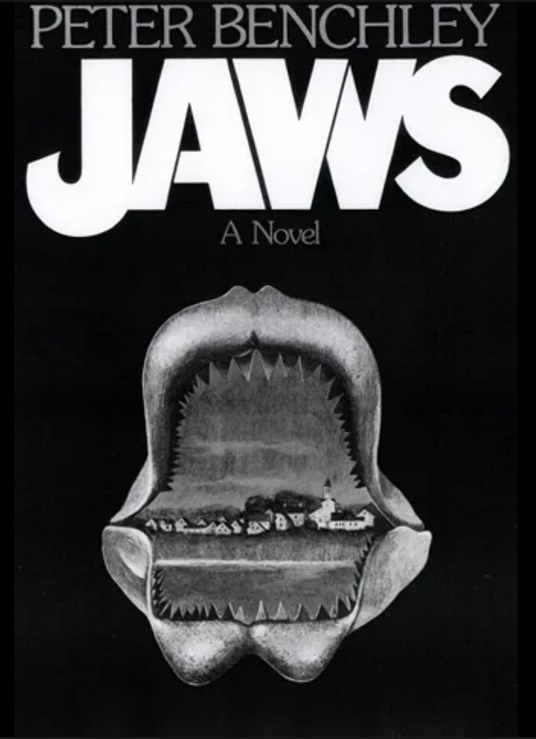
Gotfryd agreed to execute Benchley's own idea for the jacket: to show a peaceful, unsuspecting Long Island beach town framed by the bleached jaws of a great white shark. It's a genuinely interesting concept — the monster as frame, domesticity as subject, the horror lurking at the edges of the ordinary. Congdon saw the sketch and asked if they could make it more ominous, if the sky could be red, and whether the shark's bones looked too "liplike and pendulous." Gotfryd worked with the illustrator to improve it.
Then the cover went to the sales conference at the Tamiment Country Club in the Poconos, where six regional sales managers sat around a table and were shown a slide of the jacket. The salesmen were given the one-sentence sales pitch: "The exciting tale of a resort town fighting for its life against a Great White Shark" — and they were given their Title Information sheets, which noted under "School and Library limitations": One sex-fantasy scene; some profanity.
Congdon rose and made his presentation. "Of all the fish in the sea, the fiercest is the great white shark," he began. He talked about the excitement the book had generated. He tried to convey a feeling of "you'd better get with it or you'll be sorry."
The sales managers loved the book and the title. And then they saw the jacket.
There was considerable resistance. It made them think of Freud's classic dream of castration — the ‘vagina dentata’. The cover was vetoed.
That afternoon, the same sales managers, meeting without the editors, estimated they could place 25,000 advance copies in bookshops by the October publication date. For context: the average advance for a first novel at Doubleday was 4,000 copies, with a tiny advertising budget. Only a handful of the 75 novels Doubleday published each year sold more than 5,000 copies. These men had just committed to six times the average — on a book whose cover they'd refused.
The Sardine, the Typographer, and the Man Who Cried Dentistry
After the sales managers vetoed the cover, Congdon went back to Gotfryd.
"We've got a problem. Can we have just a fish on the cover?"
"The cover's not big enough," Gotfryd said. "It will look like a sardine."
This is the key design insight that often gets lost in the Jaws cover story: Gotfryd wasn't being precious. He was solving a real problem. A shark needs scale. Without scale, even a great white is just a fish. And you cannot convey the scale of the sheer impossible size of the animal, the way it dwarfs everything human — by putting a shark on a jacket with nothing to measure it against.
Unable to resolve the problem, Doubleday fell back on what publishers reach for when they're stuck: typography. They went with the title and the author's name in stark lettering against a black background. They printed 30,000 copies and jacketed the books by hand at Doubleday's printing plant in Berryville, Virginia.
Then Oscar Dystel saw the jacket.
Dystel was the president of Bantam Books, the paperback imprint that had just paid, after a frenzied auction amongst nine publishers, the then-staggering sum of $575,009 (where did they get the $9 from - it sounds like a lunch expense) for the paperback rights. When Congdon called Benchley at home to deliver the news, Benchley was in his kitchen eating breakfast. He said "Good God, Thomas," and told his wife Wendy, who burst into tears — afraid, as Ted Morgan reported, that her husband was being "raised to celebrity and remoteness."
Dystel had committed to this purchase on a gut feeling that Jaws would be a "big" book, meaning more than a million copies for Bantam, and he had very definite opinions about what "big" books should look like.
"Without an image," Dystel said of the typographic cover, "no one would know what Jaws meant. It could have been a book about dentistry."
He asked Congdon to put a shark on the jacket. Congdon went to Gotfryd. Gotfryd, who had already been through this once, stifled his exasperation and called the artist Paul Bacon…
Paul Bacon and the penis.
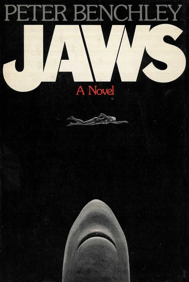
Bacon made a rough layout of an enormous shark's head. Gotfryd looked at it.
"Why can't we have a swimmer as well," he asked, "to have a sense of disaster and a sense of scale?"
And there you have it. That's the sentence that made the Jaws cover immortal. Not a creative brief. Not a brilliant illustrator working alone in a studio. An art director, exhausted by months of back-and-forth with salesmen and executives and paperback publishers, arriving at the answer to his own design problem: if the shark needs scale, give it something to scale against. Give it a human being. Give it a woman swimming at the surface, unaware, whilst the monster rises toward her from below.
Bacon came back the next morning with the completed jacket: an open-jawed shark's head rising toward a swimming woman. Dystel was pleased and wrote Congdon on 20 December: "The jacket design for Jaws is much improved. If you sell 100,000 copies we'll follow you to the letter."
"We realised that the new version looked like a penis with teeth," Congdon said, "but was that bad? I placated Alex by buying him a $17 necktie at Paul Stuart." A $17 necktie. For one of the most consequential design decisions in American publishing history.
Why Bacon's Cover Works (Even If It's Not the Famous One)
Design critics don't spend much time on Bacon's original hardcover, because it was quickly superseded by Roger Kastel's paperback version and then engulfed by the Spielberg film's marketing. But Bacon's cover deserves its moment.
It works for a simple reason: it establishes the visual grammar that Kastel would later perfect. The vertical axis is everything. The shark rises from below — from darkness, from depth, from the unknown. The swimmer is at the surface — exposed, vulnerable, in the light. The image is oriented along a single line of threat, and your eye travels that line the same way the shark does: upwards, toward the human figure who has no idea what's coming.
This compositional logic is so powerful that it survived every iteration of the image. The Kastel paperback cover, the film poster, the countless knockoffs and parodies — they all share this fundamental structure. The terror lives in the diagonal. The monster comes from below.
What Bacon understood intuitively was that the cover's job wasn't to illustrate a scene from the book. It was to communicate a relationship — the relationship between something enormous and hungry moving upward through darkness, and something small and oblivious floating in the light above it. That relationship is the entire emotional content of Jaws. Every good cover distils a book to its essence and Bacon put his finger right on it.
The Upgrade: How Roger Kastel Made History
Dystel remained dissatisfied even as the hardcover Jaws became a phenomenon. It had broken out of what advertising manager David Cathers estimated as the hard-core market of 60,000 regular bookshop customers and was reaching people who had never bought a hardcover book in their lives. Cathers scheduled TV spots to supplement newspaper adverts. Benchley went on the Today show. The book jumped in a single week from number 10 to number 3 on the New York Times bestseller list and stayed there. By mid-March 1974, there were 75,000 copies in print.
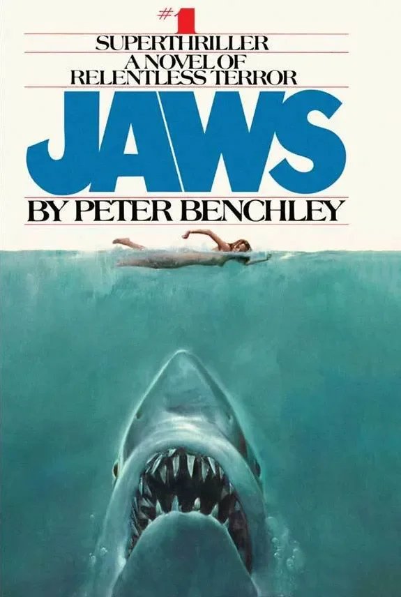
For the Bantam paperback edition, Dystel commissioned illustrator Roger Kastel to create a new version of the cover. This is the one that went everywhere — the one that moved six million copies in six months as a Bantam paperback, influenced the Spielberg film's marketing, and entered the permanent visual vocabulary of American culture.
Kastel's approach was methodical in a way that tells you a great deal about how great commercial illustration actually gets made.
For the shark, he went to the American Museum of Natural History and photographed great white specimens laid out on easels for cleaning. He studied the animal. He understood what he was painting before he painted it.
For the swimmer, he was more pragmatic: he was doing a photo shoot for Good Housekeeping and at the end of it, took five minutes to place the model on a stool and have her approximate the front crawl. Five minutes. The reference photograph for one of the most recognised images in American commercial art history was shot in five minutes at the end of a magazine job.
What Kastel did with that material, though, was anything but quick. His painting deepened everything Bacon had established. The shark is larger, more detailed, more anatomically specific — and therefore more terrifying, because it looks real. The woman is more exposed, more clearly positioned at the boundary between air and water. The water itself has depth that Bacon's version didn't achieve. You feel the darkness below.
The deep blue-green of the ocean is wonderful, the sickly yellow-green of the shark's underbelly, the warm flesh tones of the woman at the surface. It shouldn't work — it's garish, almost lurid — but it does, because it's doing exactly what a paperback cover needed to do in 1974: stop you on a spinning rack in a newsagent's, from ten feet away, under fluorescent lights, in three seconds.
And this is what gets lost when we talk about "great" book covers in the rarefied context of design criticism: commercial illustration exists in the physical world, competing against hundreds of other covers simultaneously. Kastel's cover wins that competition every time.
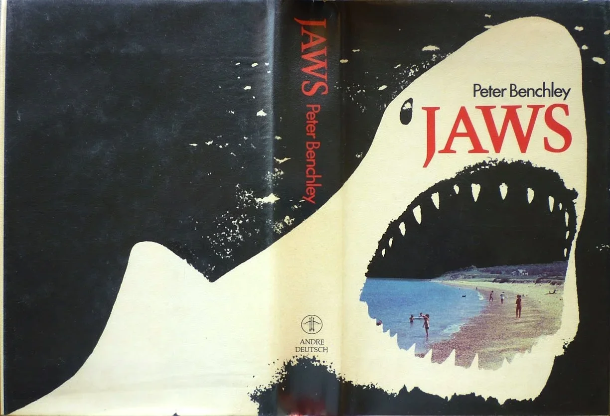
[Tom Simmonds first UK edition:]
Meanwhile… the Book Was Being Sold in Every Other Way Imaginable
The cover story is only part of what was happening. While Gotfryd and Bacon and Kastel were sorting out the visuals, the rest of the Doubleday machine was in full motion — and the details of that process reveal exactly how much work surrounds a book cover, and how much a cover has to do on its own once the rest of the apparatus falls away.
Congdon's strategy was what he called a "psychological buildup." He got an early memo of praise from Walter Bradbury — the same editor who had initially been lukewarm — calling it "irresistible, edge-of-the-chair, fast-breathing, gripping reading," and used it as currency, circulating it around the company. "If I get praise here I take it there, back and forth, until everyone is behind the book," he said.
He sent copies to 60 literary agents — "because they talk a lot" — and to writers, fishing for blurbs. The results were revealing. The essayist Heywood Hale Broun sent back a quote just tongue-in-cheek enough to be unusable. David Halberstam told Congdon over the phone that Jaws was "fabulous," then declined to be quoted: "I'm absolutely overexposed. People are going to think I'm a promiscuous overpraiser." Doubleday author Leon Uris came in with a good blurb. His wife later confided to a friend: "Leon never even read it, but I didn't want to let the team down."
Congdon also sent each salesman the first five pages of the manuscript with the note: "Friend: If you thought the beginning of SHOOT was powerful, read these first five pages of our fall novel JAWS." The blue memo sheets came back with salesmen's comments: "Truly a 'skip dinner and read through the evening' tale," one wrote. Another noted: "Just enough sex and profanity to make the story enjoyable but not offensive."
The publicity director, Julie Coryn, worked the press by downplaying the money. "They think that if a book is making a lot of money it can't be any good," she said of critics. Instead she leaned on the story: three generations of Benchleys, a family of wordsmiths, a book that was already a bestseller before anyone had read it.
Congdon even tried to send each reviewer a shark's tooth along with their review copy. His assistant Susan Schwartz called taxidermists, the New York Aquarium, and the American Museum of Natural History. She eventually found some at a shop called The Collector's Cabinet, but they cost between $5 and $40 each. The idea was dropped - which is a shame because imagine how much they’d be going for on eBay in 2026.
The mechanical shark, meanwhile, was being built by Disneyland for the film — "with a 65-foot hydraulic catapult to launch it out of the waters," as Morgan reported. Richard Zanuck told Benchley they were going to Australia for shark footage. "What if the sharks aren't big enough?" Benchley asked. "Ah, we'll put a midget in the cage," Zanuck said…
What the Jaws Cover Teaches Us About Book Design
The production history of the Jaws cover is a masterclass in several things that design programmes don't always teach.
The committee isn't always wrong. The regional sales managers who killed the Wendell Minor comp were operating from Freudian squeamishness rather than aesthetic judgement. But their instinct — that the cover wasn't working — turned out to be correct. The final image is better. Sometimes the people in the room who aren't designers see something real, even when they can't articulate it.
Scale is a design problem, not just an illustration problem. Gotfryd's insistence on including the swimmer was a solution to a practical design challenge. How do you communicate the premise of Jaws on a 6x9-inch rectangle? You give the viewer a reference point. You put a human being in the frame. This principle applies far beyond shark books: whenever you want a viewer to understand the magnitude of something, you need something familiar to measure it against.
Good covers solve the brief. Great covers transcend it. Bacon's cover solved the brief: it put a shark and a swimmer on the jacket and gave scale to the threat. Kastel's cover transcended it: it created an archetype. When people today sketch a cartoon shark menacing a stick figure, they're referencing Kastel's visual grammar, even if they've never seen the actual cover.
The best book covers work at multiple scales. Kastel's image works as a full-size cover, as a spinner-rack thumbnail, as a billboard, and as a film poster. The composition is bold enough to read at any size because it's built around a single, clear diagonal. Complexity is the enemy of legibility at small sizes.
The design conversation and the editorial conversation are the same conversation. The Jaws cover didn't emerge from a brief handed to an art director and left alone. It emerged from a sustained, messy, contentious dialogue between editors, sales executives, art directors, illustrators, and a paperback publisher who kept pushing back. The final image is a product of that dialogue — and all the best book design almost always is.
The Cover That Ate the Book
There is a coda to all of this.
In February 1974, when the book was still weeks away from hitting shelves, a small notice appeared in Publishers Weekly: "Peter Benchley has written a major novel, one that has created virtually unprecedented prepublication excitement. Over $1 million in subsidiary rights sold; 35,000 initial printing, major ad-promo." Within two years, Jaws had become the seventh bestselling novel of the twentieth century, behind only The Godfather, The Exorcist, To Kill a Mockingbird, Peyton Place, Love Story, and Valley of the Dolls — all of which had years of a head start.
Before it was published, Benchley estimated that the income from Jaws would give him the freedom to write for another ten years. He had been in debt in 1973 and was about to ask National Geographic for a staff job when the book club deals started coming in and saved him from what he called "the spectre of regular employment."
But the novel, in the long run, was consumed by its own cover. Benchley died in 2006 at 65, but his cultural footprint is nowhere near as large as Spielberg's. The book itself is richer and stranger than the film — it has a Mafia subplot, an affair between Ellen Brody and Matt Hooper, a sustained meditation on class anxiety and economic struggle in the 1970s, people genuinely worried about the price of a hamburger. It's embedded in a specific time and place in a way the film, set in a fantasy version of New England, deliberately is not. But most people who know the shark-and-swimmer image have never read the book. Many who've seen the film haven't either. My girlfriend hasn’t even seen the film no matter how many times I put it on. In her defence, she is a keen swimmer, so…
The Kastel cover is so powerful, so complete as a visual statement, that it has become the primary Jaws text. This raises a genuinely uncomfortable design question: can a cover be too successful? Can it become so dominant that it displaces the content it was meant to sell? Can a great design, in some sense, consume its own subject?
A Last Word on the Design
Whatever else you think about the Jaws cover — the messy committee process, the Freudian anxieties it triggered, the fact that it began with a comp that reminded people of castration and ended with an image one editor described as a penis with teeth, the $17 Paul Stuart necktie — you have to reckon with what it actually does when you look at it.
It puts you underwater without moving. It makes you feel small. It makes the darkness below feel inhabited. It communicates something about scale, menace, and human vulnerability that takes the novel many pages to establish.
It doesn't summarise the book. It doesn't illustrate a scene. It creates a feeling — a very specific feeling — that makes you need/want to open the book to find out if the inside delivers on what the outside promises… or at least it used to before we all preferred reading to sitting in front of the TV.
The Jaws cover delivers in spades. Roger Kastel spent five minutes photographing a model on a stool and made an image that has lived in the collective unconscious for fifty years.
That's book design doing exactly what it should.
***
Stuff I found out later:
The cover, it turned out, caused its own controversy — it was banned in Boston and St. Petersburg on the grounds that the swimmer was nude. Kastel worried the backlash might end his career. Bantam loved the publicity. There are some things you simply can’t buy.
Kastel went on to paint the poster for The Empire Strikes Back in 1980 — that romantic clinch between Han and Leia, consciously modelled on Gone with the Wind. Two of the most recognised pieces of commercial art of the twentieth century, from the same pair of hands. Not bad for a man who spent five minutes photographing a model on a stool…
***
Sources:
Ted Morgan, "Sharks and Then and Then and Then — The Making of a Best Seller," The New York Times Magazine, 21 April 1974; Zachary Petit, "The Making of Jaws' Iconic Book Covers," PRINT Magazine, June 2020; Kevin Mims, "Here Comes the Bite," Quillette, 31 January 2024.